
Create and Design brand identity and Logo for a NEW motorcycle business
Conceptualise and design a logo for the 'The MotoPro Ltd'
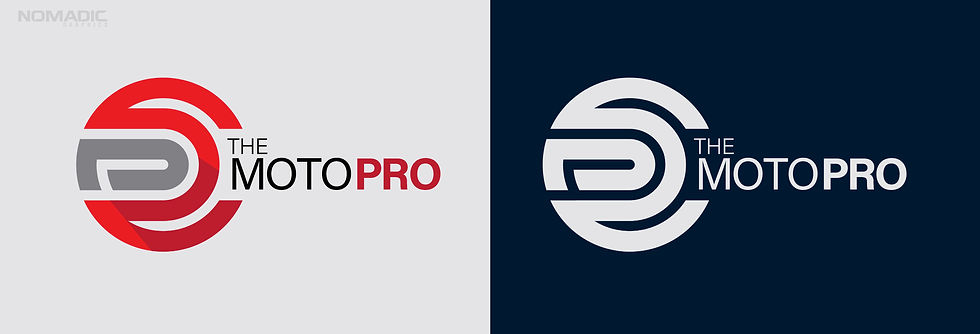
Client: The MotoPro
Inside the Studio: Designing The Moto Pro Ltd Logo
Getting started:
When The Moto Pro Ltd asked me to design their new logo, I knew my role wasn’t just to create a mark that looked good. A logo has to do more—it must reflect the company’s values, its personality, and its goals. To get there, the process has to be thoughtful, deliberate, and structured.
The work began with understanding. I sent a detailed questionnaire to the client, asking not just about colours or design styles, but about the company itself. What do they do? How do they operate? What are their goals, ethics, and unique strengths? How do they want their customers to feel? Reading their answers, I began to see the business from the inside out. The questionnaire became a map—a guide to the essence of the company and how the owners saw and felt about the business.
With that foundation, I moved to the studio and started thinking visually. I didn’t open Illustrator or sketch right away. I let the ideas turn over in my head, considering the company’s personality and how that could translate into shapes, lines, and colours. For The Moto Pro Ltd, I wanted the logo to communicate precision, reliability, and movement. I thought about angles that suggest focus and curves that suggest energy. Every line needed purpose.
Here's a few of my early working designs that I liked but ultimately discounted.

Colour was next. I chose with clarity and adaptability in mind. The logo had to work in full colour, single colour, and reversed out on different backgrounds. It needed to remain recognisable whether it appeared on a website, a business card, or the side of a van. Colours had to support the message without overpowering it. I'll also admit that I like using red for sports brands.
Then came a moment of inspiration. I remembered the simple, familiar shape of a motorcycle helmet, viewed from above. The company name sits in the visor space of the brand shape.
The form immediately felt right. It carries meaning for the company’s audience: adventure, protection, and focus. I began sketching, testing proportions, refining curves, and adjusting lines. I could feel the logo taking shape, balancing boldness and simplicity, recognition and flexibility.
I experimented with scale, thinking about how it would look large on signage and small on stationery. I tried different colours and single-colour variations. Every test was a chance to ensure the design was strong, adaptable, and true to the brand.
With a final design chosen I still felt it needed to 'lift from the page'. I felt it needed to feel as though it had some dimension. I ended up crafting a very subtle shadow into the design. Can you spot it? It's subtle but it's there.

Finally, the logo came together. The helmet-inspired shape, clear lines, and carefully chosen colours formed a design that is recognisable, flexible, and meaningful. It’s simple, yet communicates the company’s identity at a glance. Every element reflects who The Moto Pro Ltd are and what they stand for.

Designing a logo this way is about more than aesthetics. It’s about understanding, thought, and translation. It’s about capturing the essence of a company in a single image. With The Moto Pro Ltd, the result is a logo that works commercially, communicates clearly, and tells the company’s story without a word.
If you would like to learn more about The MotoPro you can visit their new website (yes, built by your truly) at www.themotopro.shop
Thanks for reading this far.
If you need a rebrand or would like to get tin touch for any graphics or design work, please drop me a line. Phone: 07534 692684 or email at simon@nomad-graphics.com
Power in Numbers
Adobe Illustrator
Programs Used
23
Time Allotted in Hours
Thrilled
Client Status
Project Gallery


