Design a logo and brand identity for YouTube Influencers
Conceptualize, create and design a logo for the 'NEXSTAGE'
Client: Cole and Lisa Stage
The thrill of a new project never fades, and recently, I had the distinct pleasure of collaborating with Cole and Lisa Stage, the dynamic duo behind NEXSTAGE.

Their vision? To share their incredible journeys through the world's arid landscapes, fueled by adventure, a passion for global cuisine, and their trusty steed, 'Jeeves' – a truly unique Land Rover. My mission? To craft a logo and brand identity that captured this essence: timeless, adventurous without being predictable, and versatile enough for everything from a website to a t-shirt.
Let me tell you, conceptualizing a brand identity from scratch is a fascinating tightrope walk. You're balancing the client's personality and aspirations with the need for something visually compelling and strategically sound. With NEXSTAGE, the immediate challenge was distilling their multifaceted identity into a single, impactful visual mark. They weren't just travelers; they were desert explorers, food enthusiasts, and the proud owners of a legendary vehicle. How do you weave all that into a cohesive and uncluttered design?
Here's a few of my concept's that I took from pen and paper over to the computer.


My initial dives involved sketching countless iterations. I explored abstract representations of desert landscapes – the undulating lines of dunes, the stark silhouette of rock formations against a vast sky. I considered incorporating elements of their Land Rover, Jeeves, but I was wary of leaning too heavily into an automotive aesthetic, which might overshadow their broader travel and food focus. The key was to evoke the spirit of adventure and exploration, not just the mode of transport.
The idea of "timelessness" was a constant filter. Trends in design come and go, but a strong logo needs to feel relevant for years to come. This meant steering clear of overly stylized fonts or fleeting visual fads. I gravitated towards clean, strong typography that exuded reliability and a sense of enduring quality, much like Jeeves itself.
Avoiding clichés in adventure branding was another crucial hurdle. Think of all the compasses, mountain peaks, and generic globes out there!
I wanted something more nuanced, something that hinted at the unique character of NEXSTAGE's expeditions. This led me to explore more symbolic representations – perhaps an abstract mark that suggested a journey into the unknown, or a visual metaphor for the convergence of exploration and discovery.
Versatility was also paramount. The logo needed to look just as good embroidered on a patch as it did gracing their website or printed on a postcard. This meant considering scalability, ensuring legibility at various sizes, and thinking about how it would work in both colour and monochrome.

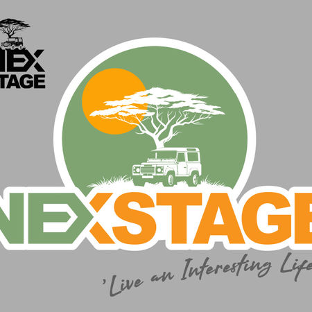
After numerous explorations, a concept began to solidify. It centered around the interplay of two core elements of the brands name: a stylized, abstract representation of the letter X, which I used to create a split between the brand name, defining the diference between the letters NEX and the following letters STAGE. The simple break using colour a subtle nods to their desert explorations and the sense of change and endless possibility. After all every journey, every idea, every day is in some way a 'NEXSTAGE' of life. it's a little deep but I liked the visual play and wonderfully, so did Cole and Lisa.
The 'X' is crafted to feel both grounded and dynamic, hinting at their expertise and adventurous spirit. The typography chosen for "NEXSTAGE" is a strong, sans-serif font with a touch of subtle character that feels both modern and enduring.

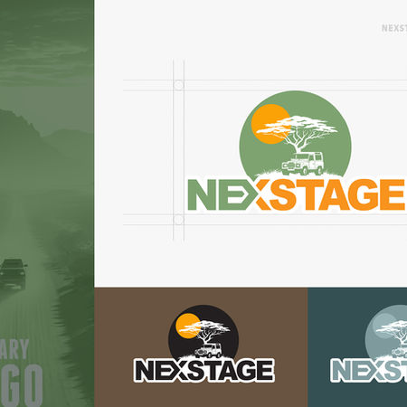
The colour palette was carefully considered too. Earthy tones, reminiscent of desert landscapes – warm ochres, sandy beiges, and perhaps a touch of deep blue to evoke the vastness of the sky – felt appropriate. These colours also lend themselves well to various applications, feeling natural and authentic.

After a lot of consideration it was felt that a visual representation of Cole and Lisa's trusty Land Rover should be brought into the design. Although, Cole and Lisa's travels are focused on so much more, there was no getting away from the fact that 'Jeeves', the modified Land Rover, was very much a part of the family and a big part of the past and upcoming journey's that will be shared via the YouTube Channel.
With the decision made it was time to make the logo feel balanced: This I did through the use of circles, lower elements (the grass savannah) and a wonderfully symbolic tree. The iconic tree shape resonates with African travel.


Presenting the final logo and brand identity to Cole and Lisa was a moment of anticipation. Seeing their faces light up as they recognized the visual story we had crafted was incredibly rewarding. It wasn't just a logo; it was a visual embodiment of their passion, their unique adventures, and the spirit of NEXSTAGE. It’s a reminder that the most challenging projects often yield the most satisfying results, and I’m excited to see how their brand journey unfolds.
Check out some of the mock ups and design below.
Thanks for reading and checking out my work. If you need design work of any kind, drop me a line, I'd love to chat.
Email: simonthomas@2ridetheworld.com
Tel: 07534 692684
Power in Numbers
Adobe Photoshop, Adobe Illustrator
Programs Used
18
Time Allotted in Hours
Delighted
Client Status
Project Gallery


